Wednesday, 4 December 2013

My assessment and self evaluation.

When I first saw my partners design initially I was pretty pleased with it; as it was a pretty design that did not look to complicated to create. However I was slightly worried about how I would create the brow design. I am horrific at drawing  freehand as my partner was not sure how to apply the design I was extremely pleased she made a wise decision to use a stencil. I was also a little concerned about creating an ombre lip as I have never created an ombre lip before. However I got the idea and tried how I thought you would create the lip and I had no trouble at all!
From my partners design and from lessons I have learnt how to line lips in a more precise way which helped me improve my technique ready for my partners design.
 If I was to do this design as my own I  probably would of invested in a smaller fluffy blending brush like the mini applicator ones you can get as I found the brush was to thick. As I was blending the lip mixes together the bristles would go above the lip creating a smudge. Red is a nightmare to hide on a pale base it just looks like she has erythema. But thankfully I managed to conceal the redness. I probably would of maybe fake tanned a bit so there was more of a contrast between my partners natural skin tone and the alabaster colour.
 Overall I was fairly pleased with the outcome but felt I could of done it better as the ombre did not show up in the photo which was disappointing so I wish I did the outside of the lips darker to show the contrast but my partner wanted it to be more of a red than a plum at this point.  I was pleased at my timing and that I was able to finish the look how she wanted.

Here is the consultation form of Hayley. Her skin had no contradictions, and shew as not allergic

 to anything on the day not restricting my makeup application.

Face chart.


Wednesday, 27 November 2013

Peer assessment.

On Monday 25th of November Hayley completed her assessment which consisted of her doing my makeup and hair design on me. Using only my information pack to create my look, as well as practice and watching me create the look.

Whilst analysing Hayley like asked I took note of how Hayley handled the assessment. Hayley practiced my makeup design three times.
Hayley applied an even,seamless skin base all over. Hayley followed my instructions well and paid attention to the techniques I wanted the makeup to be applied i.e I wanted the foundation buffed into the skin with a buffing brush not with a sponge or brush.She created the look intended. Hayley was very hygienic using hand gel constantly and clean mascara wands. She looked professional and I had confidence that she would create my design well. However she did not have enough time to apply my bottom set of eyelashes which I was a bit disappointed about.  However I felt that Hayley used the time effectively as the makeup did need more attention than the hair. However I was pleased with the out come.
If I was do my design I would've spent less time blending the foundation as I felt it was blended well enough and applied the bottom lashes as these looked really effective. I have learnt from Hayleys assessment that I will start on the hair design first as I would like the makeup to look as fresh as possible and to ensure I have time for the finishing touches that really make the design. My makeup still looked fresh but started to crease slightly in areas. But Hayley executed the design well and I was pleased with how well she created my design.


My information pack.

For my look I put together a pack that included all of the details of each section of makeup so my partner did not forget a single detail. 


Sunday, 24 November 2013

My Final design.

I wanted to create an update of my design. After designing my face chart and practicing my design on myself I wanted to blog my development of my design.

 I have decided to make the eyebrows even whiter by applying MAC's eyebrow pencil over them first then applying the white foundation. I also want the eyebrows to be elongated using MAC's white eyeliner to exaggerate the bleached out brows. I also want the brows to be fluffed up with a brow brush to add texture.

 I am going to create some white eyelashes for the top lashes and the bottom I will paint them white to really exaggerate having white eyes. This also helps keep the face pretty neutral.
I feel the lashes will look a lot more powerful and and clean as the white on the eyelashes tends to transfer onto the skin creating white blotches and goes in the creases under my eyes which is not good! This will also help our time management.

I have decided after practice to have the Henna stencil ending at the shoulders seeing Botticelli's Primavera painting of the goddess named Flora has inspired me to bring the design below the neck to represent the ruffle. As her flowers begin at the neck. I have also decided that I did not like the henna pattern being all over the neck and have agreed with my partner that the Henna should go from the top of the to the shoulder just on the left and right side and down the middle of the neck. However the pattern going down the middle will only go in between the collar bones. We will make sure this looks as precise as possible  by drawing a guideline in white eyeliner.

Creating my partners design.

Creating my partners design.

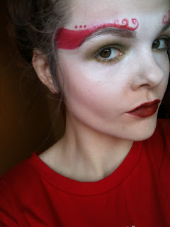
 First I applied the base. Hayley wants her design to have a sort of mask effect. Alabaster skin around the eyes like a masquerade eye mask. The rest of the skin her skin colour to  exaggerate and show contrast between modern ideal beauty and 15th century ideal beauty.
 For this I used Kryolan stacked foundation  in my skin shade. Illamasqua's white foundation base for around the eyes. To me this does not make too much of a contrast it just looks like I am highlighting my eye area as I am extremely pale. However Hayleys skin is much warmer so will look ideal on her face and will demonstrate her concept well. Hayley does not want a heavy mask effect she would like it blended well so it does not look to sharp.I used a buffing brush to blend the product into the skin using the lightest shade first,then my skin colour, then went over the palest shade and blended.
 Here the blusher has two purposes to contour the cheekbones and to add a pinch of colour. I used Illamasqua powder blusher in shade Tremble.
 This idea again demonstrates the rosy cheeks the Elizabethans would wear, yet a contemporary twist on exaggerating the bone structure. Hayleys wants the blusher to be subtle yet strong so blended well as the main focus will be on the eyes, and lips.


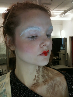
 I then lightly filled in my brows. Then using aqua colour I attempted to draw on Hayley's eyebrow pattern which I believe she may be stenciling or creating out of ribbon. I am no artist and think this looks as if a child has painted it. I think if I practised with the right brushes this is an achievable look. I then applied a dark subtle wash of green on my eye lid up to the crease. I then applied a lighter green on my lower lash line using a flat brush. I then applied a light coat of black mascara.


If this look is applied well I think it could be a really pretty look once it is all pieced together as the look is very soft. Then the brow is strong so I think it is a nice contrast.


Hayley had a red subtle ombre lip on her design. I created the lips using MACS lips mix in red and black. I applied MAC's red lip liner all over the lips to stop the lips from bleeding and it set a really nice base and outline. I then apply just the red lip mix to the middle as when experimenting with Hayley before I mixed the red with the white and it went a pink shade of red and she decided she wanted more of a blood red. I applied the red to the cross bow of the lips and at the center of the bottom lip. I then applied the mixed black and red colour (plum red) to the corners of the mouth into the center rubbed my lips together to get the ombre effect. I then used my eye blending brush to blend the colours out nicely and to clean up the lips a bit and this was the outcome. I love these lips they are even very much  on trend for this season.


Reflection.

I really like Hayley's design, and I enjoyed re-creating it. As it is one of these looks to me that when you start applying the products to the face I was a bit wary about whether it would look okay. But once the whole look is pieced together the look, looks complete (apart from the brows they need work). The timing was really good it took me a total of 40 minutes to complete the look.

I feel that Hayley’s look communicates an Elizabethan feel to it. The skin being a contrast of pale to a warm colour on her skin. The rosy cheeks that have two purposes both modern and could be referenced back to that era. The red lips with a modern twist, the eyebrows incorporating paper self and Elizabethan swirls. Hayley has also used elements from our practical sessions such as complimentary colour the green eyes, against the red lips and eyebrows, and monochromatic colour with ombre lips. Her look shows a mixture of classical Elizabethan makeup with a contemporary twist.

I find this look fairly simple to recreate. However I am worried about the red eyebrow design if there is not a stencil or ribbon I can stick on involved. I will practice this look on Hayley constantly getting her feedback on how she wants the design executed. Although on me there was not much of a skin contrast I feel she has designed her look well to suit her own face, considering her skin tone and eye colour.


Creating Hayley's design on Hayley.

Creating the design on someone else is not as easy as it is creating it on yourself as you know your face better than anyone else. But the design suited Hayley's face a lot better than mine. I was concerned about the brow pattern. Luckily Hayley supplied me with a stencil which I used eyeshadow to on the stencil to create her look. This looked a lot more effective and precise than me freehandedly painting it onto her. After practicing on Hayley I now feel a lot more confident that  can create her design.

Thursday, 14 November 2013

development of my final design.

Trialing some of my look ideas. I wanted to try out a bee-stung lip as I feel it would suit my design I am considering using. I decided to use red as it represents royalty and women would often have red stained lips. referring to James Shirley The fair falon poem. As well as the colour symbolism in the film Elizabeth Shekhar Kapur 1998.
I quite liked the look of the lips in a dark red however I am not sure whether I am going to do the lips with more of a brown toned red or even brown. As once I bring my design together I am going to have a lot of warm colours in my hair so I was thinking about keeping the face cool with blusher adding a pinch of colour to my face. I found the lips rather easy to do and not time consuming.


As the embroidery on the clothes instantly reminded me of henna patterns I decided I wanted to use an embroidered pattern somewhere on the face. I initially wanted it on the lower half as the hair is going to be strong so I want to keep the face clean and plain looking, whilst still using elements of Elizabethan makeup. I also wanted it here due to where Flora's flowers stop on her neck on Botticelli's Primavera painting.  I wanted to use Henna as it was a well known beauty method for dying the hair a shade of red.


Here are some images of the embroidered look I wanted to create. I created it using Henna stencils. I applied a matte brown eyeshadow on with a fluffy blending brush to make sure the pattern looked soft.
I like this look however I will need to supply sellotape as the stencil tended to slip so the patterns were slanting slightly.

Dramatic Elizabethan look.

Today we had the chance to recreate'copy some contemporary Elizabethan makeup. One was a gothic look and the other was quite dramatic and had golden tones to it. Both with extremely pale bases.

As I only had 10 minutes t create the look due to going second I felt it looked awful! The base was too thick, and the cheeks could of been blended much better. I was quite proud of how neatly I lined the lips considering I did them in one minute. I t does look very theatrical if I was to do this again obviously I would blend the base into the neck .

Wednesday, 13 November 2013

Final face charts.

Here are my three final face charts that are all Elizabethan inspired. All three have been inspired by Elizabethan looks, colours,textures, and some of which have been inspired by some of the techniques learnt in class.

This look has been inspired by both of my previous face chart designs. Taking the simplicity from one and taking the Henna embroidery inspired design from another. The henna idea was also inspired by a painting by Renaissance artist Botticelli. As well as the fact that the Elizabethans would die their hair using henna I illustrate this by the henna neck design. In this design I would like to block out the brows or make them white Aqua paint. On the Eyes white eyeshadow,pale base,rosy pink cheeks("a white skin was essential feature perfect beauty" The artificial face,Fenja Gunn.) and a bee-stung lip. I am not sure whether do a brown toned lip. Henna going up the neck and jaw.

Product list.

 Primer:Illamasqua matte primer.
 Foundation:Illamasqua white base foundation. 
 Powder:Illamasqua translucent powder.
 Concealer: NC15 Mac studio sculpt.
Contour: Almond kryolan powder.
Blusher: Rosewood Kryolan.
Highlight: Highlight powder Kryolan.
Eye shadow:Krylon matte white.
Eyelashes:White painted false eyelashes.
Eyebrows:Aqua colour white.
Lips:concealer NC15 Mac studio fix.
Lip colour: Lady Danger Mac,Lc008 Kryolan lip palette.

 This look was inspired by the gold and jewels that the aristocracy used to wear. I also used warm colours on the eyes to represent the warmth of the hair. I want the skin to almost shimmer as I feel this adds a nice rich texture to the luxurious look I have designed.

Product list.

Primer: Mac Prep and prime neutralise.
Foundation Illamasqua white base foundation/Kryolan event foundation pearl.
Concealer:Mac Studio fix NC15.
Powder:Illamasqua translucent powder.
Blusher:Rosewd Kryolan.
Eye base:Event foundation Kryolan pearl.
Eye shadow:Cherrywood Kryolan/ matte white eyeshadow.
Eyeliner:Blacktrack Mac.
Mascara:Lancome Hypnose mascara.
Lip colour:LC004 Kryolan palette.
Illamasqua:Metallic Gold.
This look was inspired by the greens that were often displayed on dresses in portraits. I wanted to exaggerate the rosy cheeks by using the contouring and highlighting techniques learnt. I also used complementary colour with the red lips and dark green eyes. I used a metallic colour on the eyes for texture.

Product list.

Primer:Illamasqua Satin primer.
Foundation:Illamasqua white skin base foundation.
Concealer: MAC Studio fix NC15.
Powder: Illamasqua translucent powder.
Blusher/contour:Rosewood Kryolan.
Highlight:Highlight Kryolan.
Eyeshadow:MUA Smoky eye palette/Kryolan white matte eyeshadow.
Mascara:lancome Hypnose mascara Black.   
Eyebrows:MAC Spiked.
Lips:LC008 Kryolan lip palette.
Mac black track gel liner.